Brand Identity
Logo
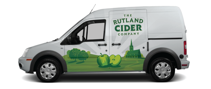
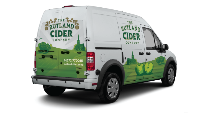
The logo was designed to fit in with the rich heritage of the brewery whilst placing the brand to have an up-market feel that would reassure the buyer in the quality of the product.

Colours
The colour palette was inspired by a rich English heritage that felt synonymous to the county. The primary green colour has a strong British connection whilst also being linked to the flag of Rutland. The highlights of gold, bronze and cream gives the palette a royal theme that embeds the brand in history.

Typeface
Lovato typeface family was chosen for all communications. It's modern take on a blackletter inspired font was the perfect choice for an identity that communicated a rich heritage bought into the 21st Century.

The Drinks
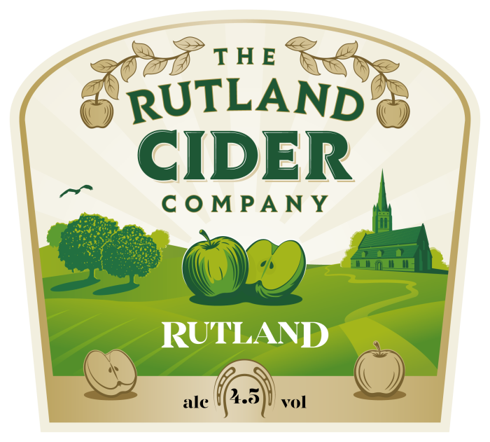
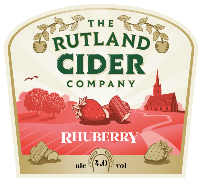
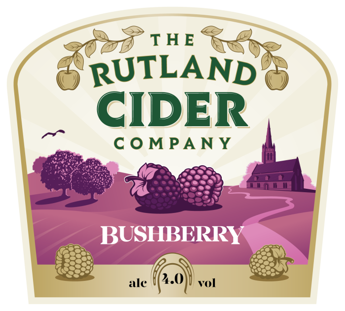
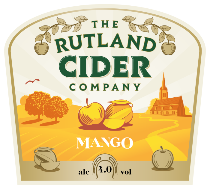
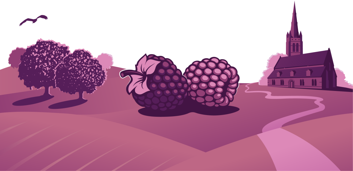
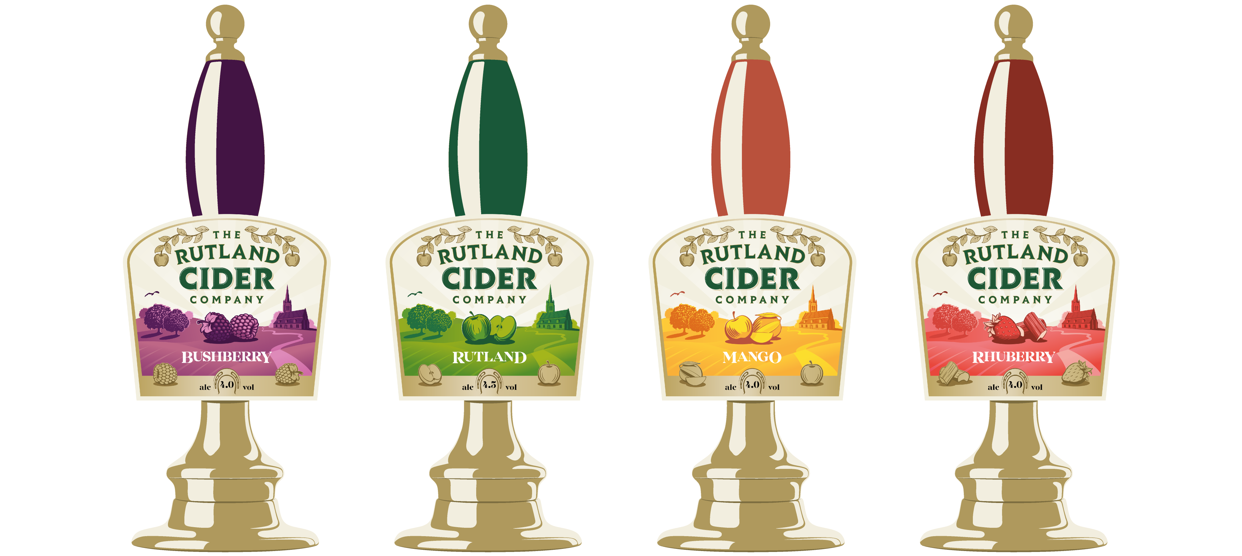
Illustrations were created for each of the drink flavours and set to a backdrop of rolling hills and iconic Rutland imagery. Each drink design is saturated in the colour inspired by the fruit it is based on whilst carriying an unmistakable brand identity that is consitent across all the designs.
