Identity
Logo
To tie into a name change that better focused the aims and vision of the organisation - a company wide exercise was carried by member who each took to propose a new design for the logo. After finding many of the designs kept the Big "O" logo-mark from the original logo we decided that this mark was integral to the identity of the organisation around Oxfordshire. We took the original design and evolved it to give it a cleaner motion that would be suitable for big and small sizes.

Colours
The colour palette similar to the original logo so we could ensure a smooth transition that would ensure the brand was recognised.

Typeface
A bold and modern sans serif typeface was required for all communications that would be flexible for both online and offline communications.


Website Redesign
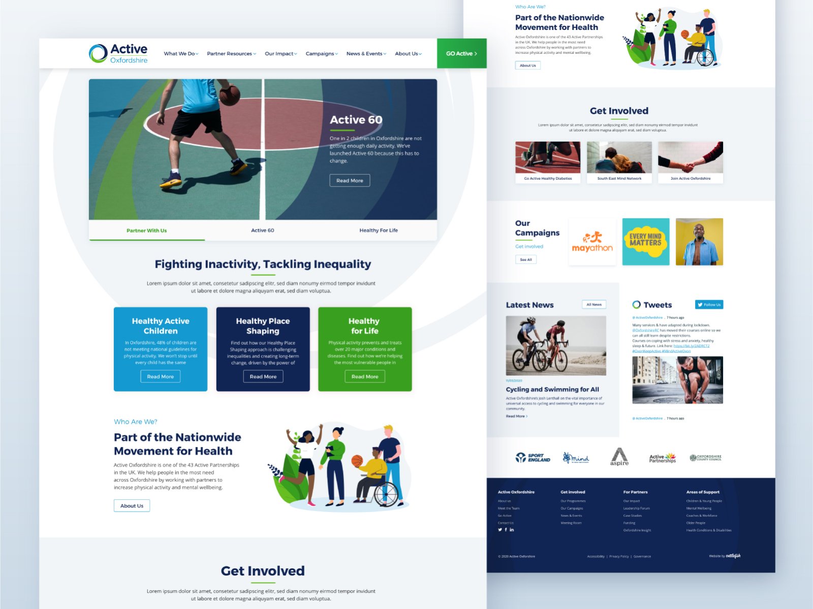
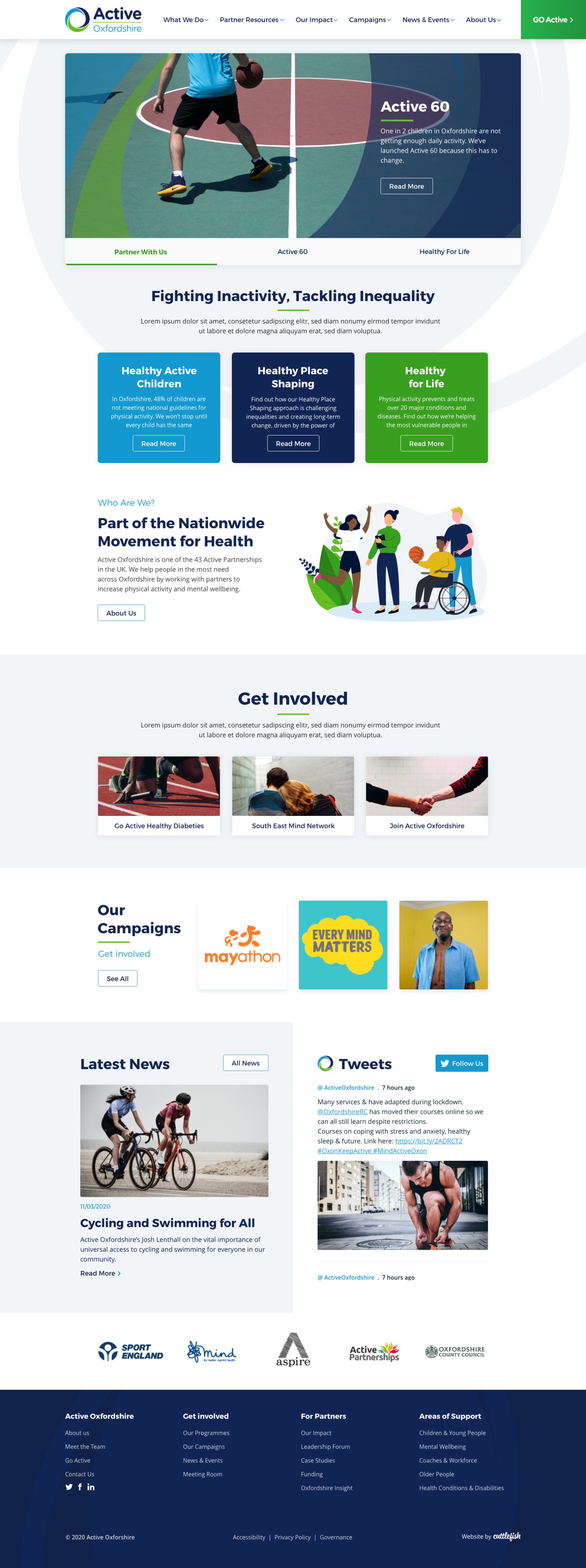
Along with the new Active Oxfordshire rebrand, we developed and designed their existing website (and programme micro-sites) to align with the new direction.
The new design helps promote the 'three pillars' on which Active Oxfordshire operates and works as a platform for both the public and partners.
With a new site tailored to the content, users are able to navigate and find useful information and resources with immense ease.


