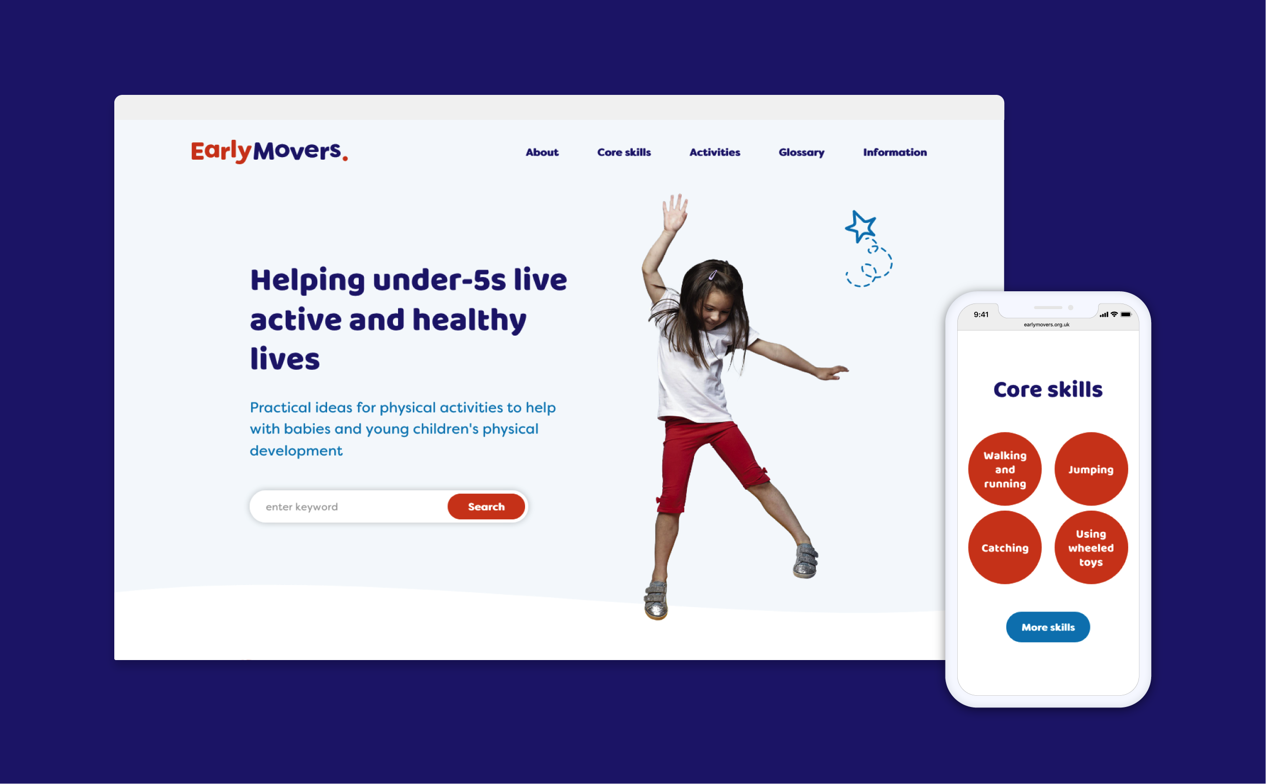
Identity
Logo
A complimentary palette made of strong, trustworthy blue's matched with a stand-out orange.

Colours
A complimentary palette made of strong, trustworthy blue's matched with a stand-out orange.

Titles & Headings
A fat rounded heading with a family feel and heaps of personality.

Body Text
A soft body font which fits in right at home with the playful style of the identity.

Easy to Use
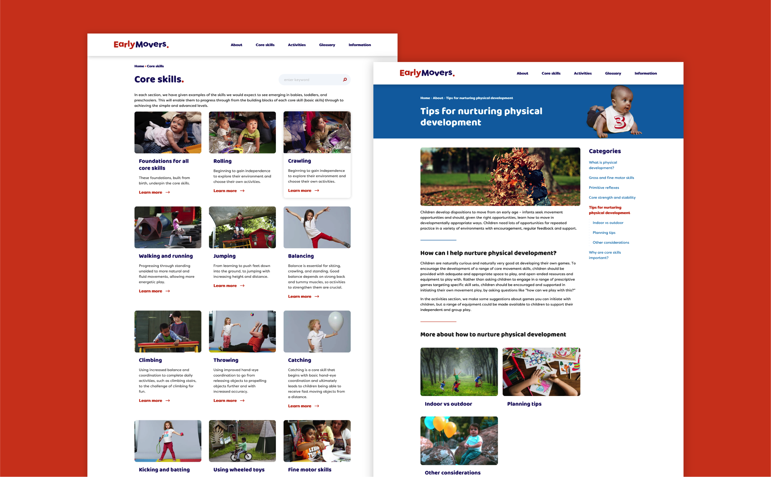
The website needed to guide users through categories in order to learn about the core principles of early years physical development. It then provides advice on the overall expected progress at different developmental stages to assist practitioners in observing babies and young children moving.
The website administrators can easily add and update new content to the database and choose when to push them live. We included a glossary that would provide descriptions for the movement vocabulary used, and ensured that the definitions would link anywhere each word appeared across the website.
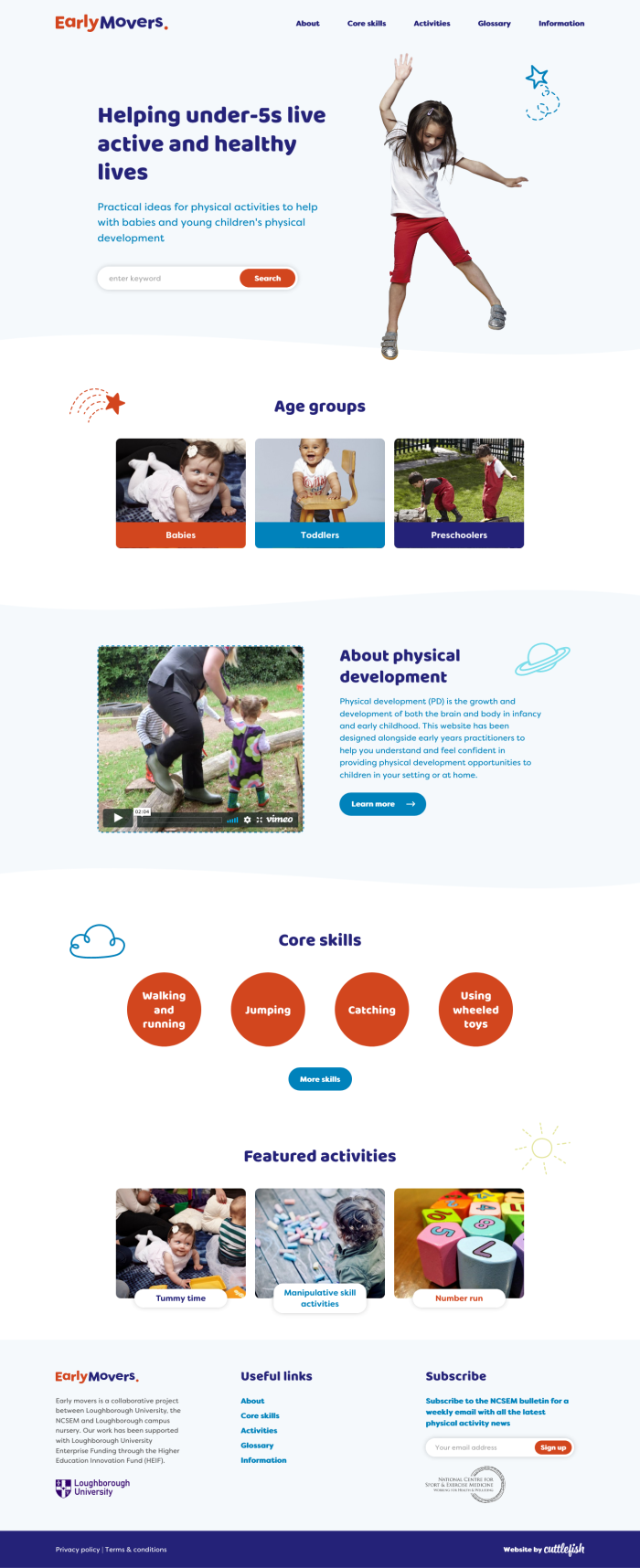
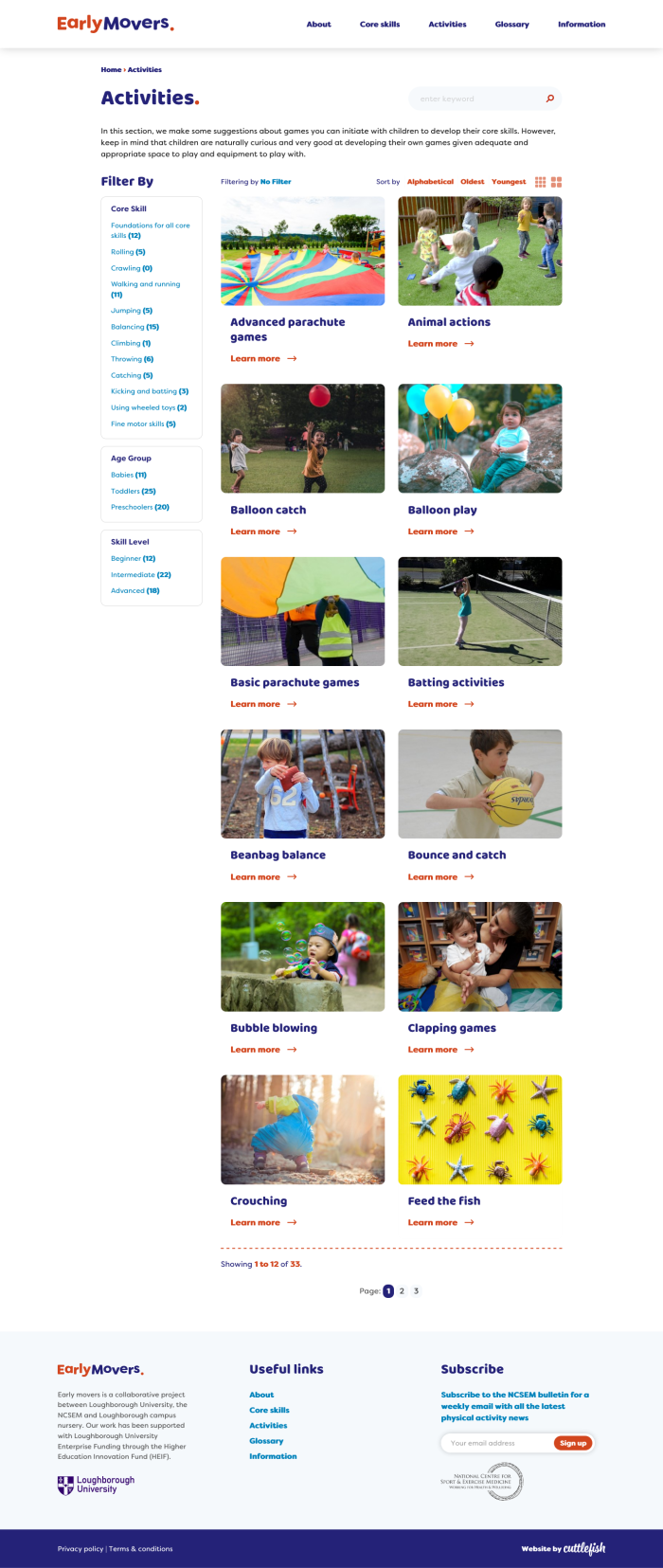
Resource Library
We created a platform that would clearly demonstrate the different categories and activities - including downloadable resources, embedded video files and imagery. Users are able to filter activities according to Core Skill, age group and skill level to make sure they are getting accurate information for the right stage of progression.

