Approach
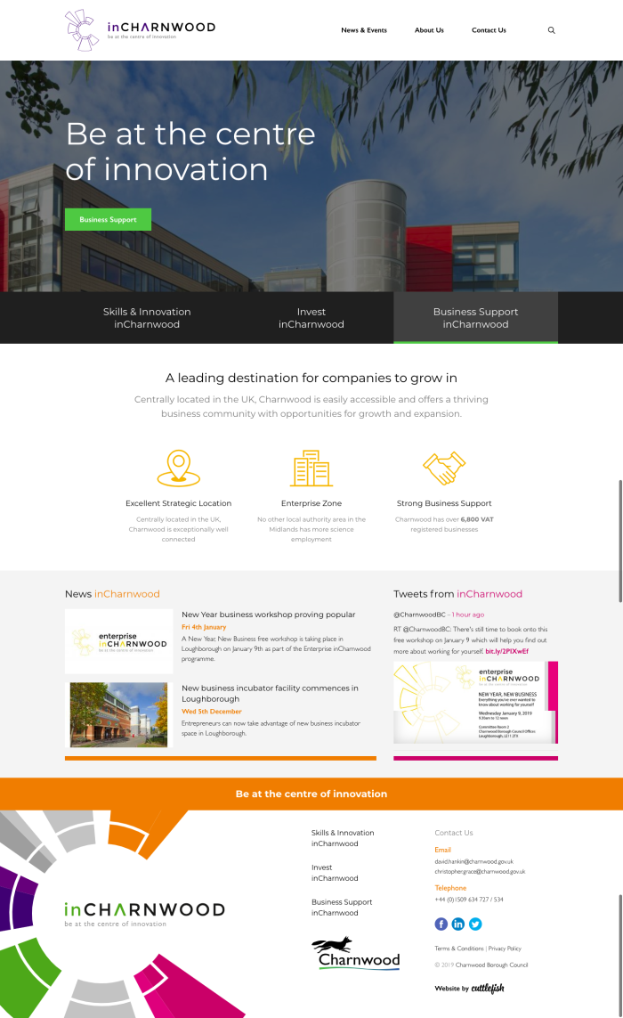
Bold visuals and clear navigation buttons were designed to ensure that users could easily navigate around the site, and would be effective for mobile viewing. We decided to colour each development priority section a different bold shade so that it was obvious which part of the website navigation a user was within, whilst maintaining the core navigation tabs at the top of each page (News, Events etc)


