Brand Discovery
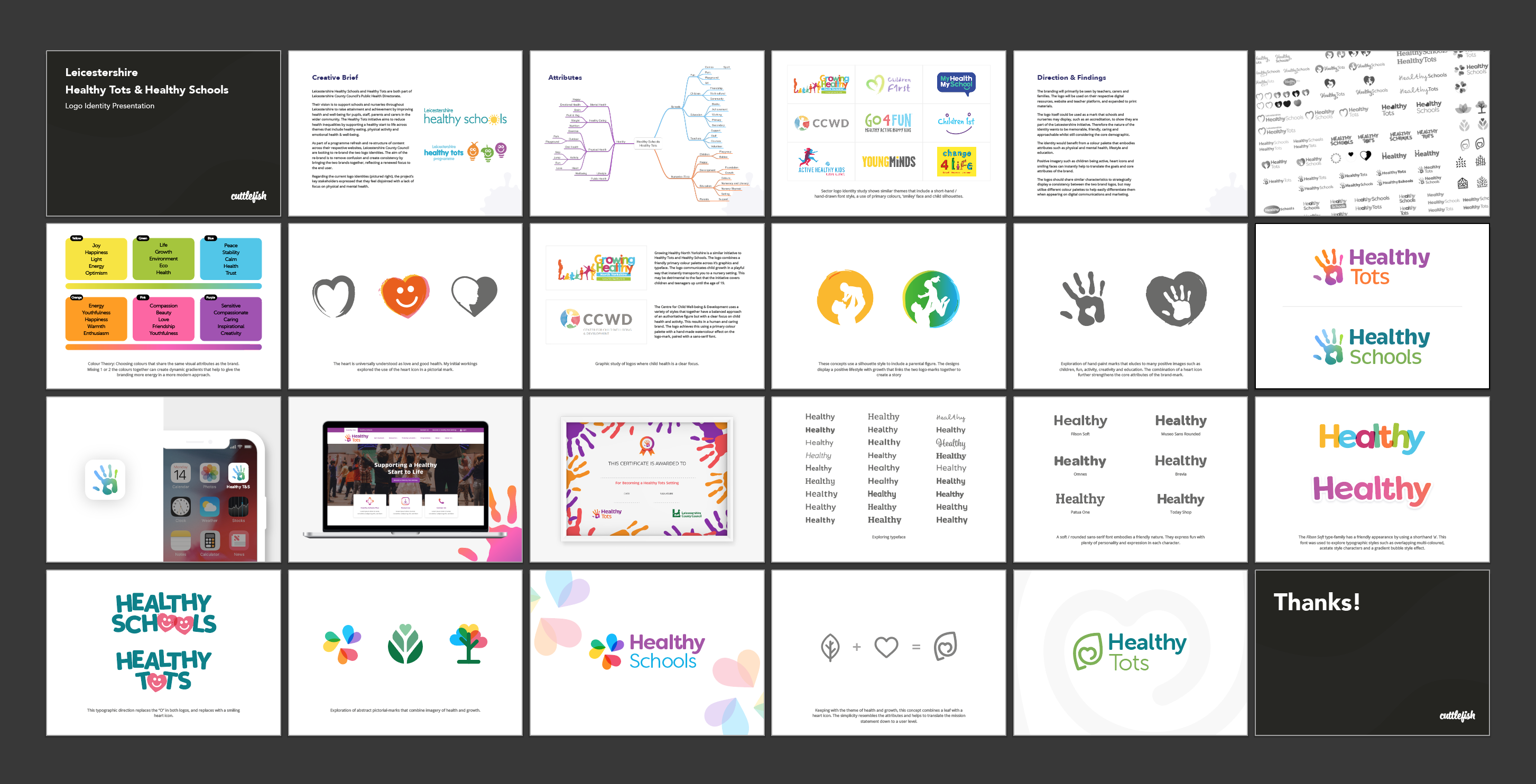
To begin this re-branding project we delved into the programmes and their audiences. We first devised a mind map of attributes linked with the subject to provide an overview on how it would be perceived by types of audience that interacted with each programme and their services. This helped us with the exploration of colour, typeface and logomark and were shared to the client in a 'first round' logo presentation.
Identity

Healthy Schools
A complimentary palette made of strong, trustworthy blues matched with a stand-out orange.

Healthy Tots
A soft body font which fits in right at home with the playful style of the identity.
Typeface
A fat rounded heading with a family feel and heaps of personality.

Simple to Use
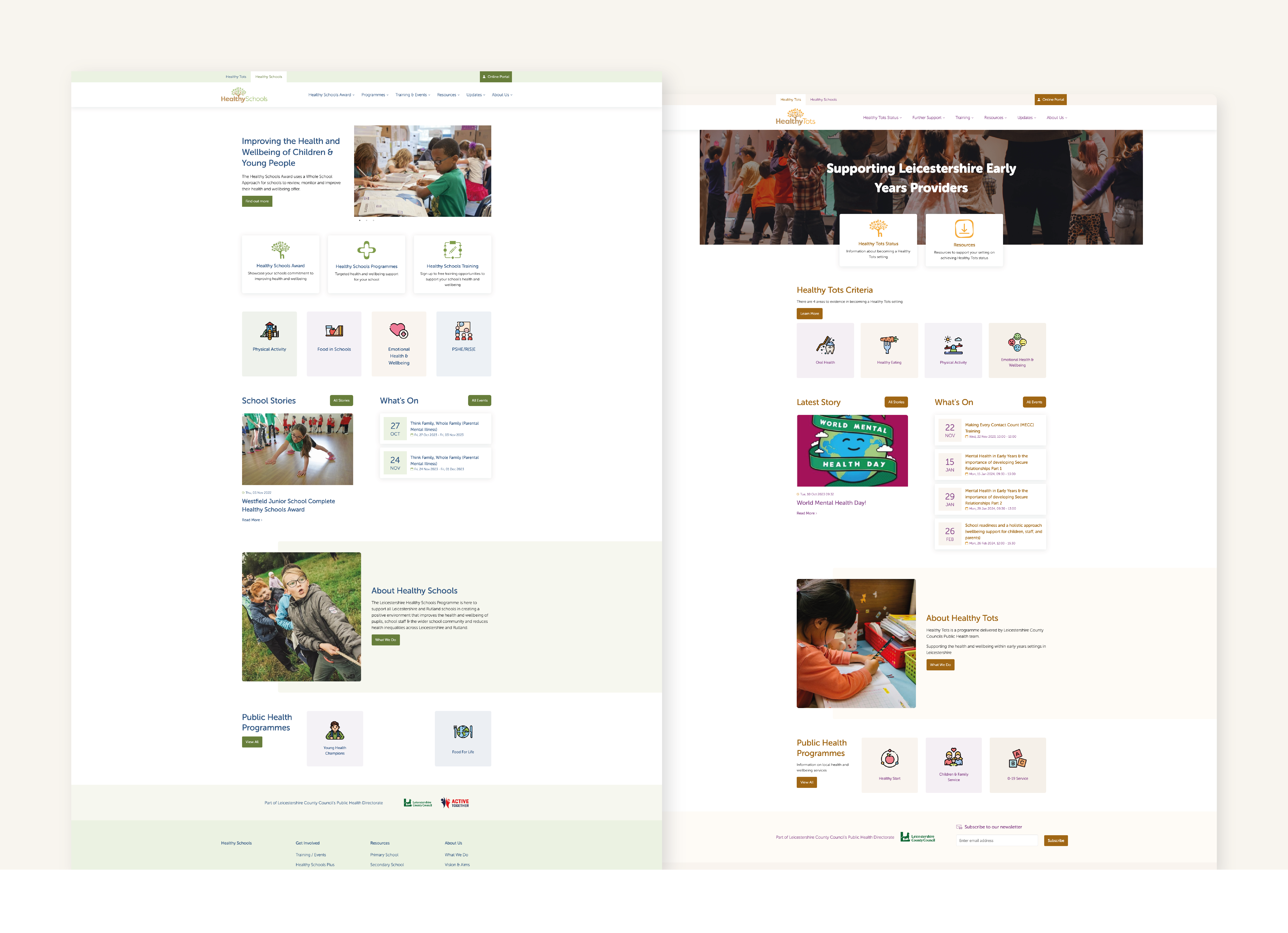
We took some time at the start of this process to consider the user journey. It became obvious that we needed to create something straightforward with prominent call to actions and appealing graphics.
In order to provide the user a sense of comfort and familiarity, we also opted to keep the websites comparable. We created a basic pastel palette to distinguish between the two using the logo hues. This gives the websites a unique identity and a shared sense of place.
Bookable Resources
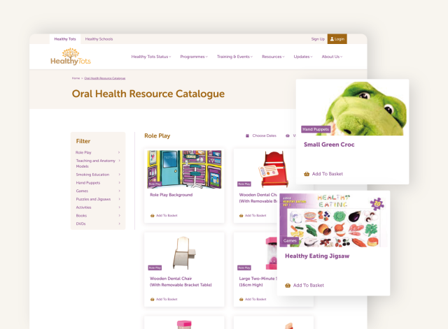
The Oral Health Team promote their services on the Heathy Tots website, and required a booking system for learning establishments to reserve physical resources.
We therefore created a database of their resources and the ability for teachers to book their chosen items for a set period of time. The Oral Health Team are able to manage the booking periods, quantities of items and each booking using an admin area.
eLearning
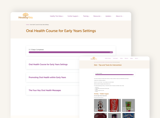
An eLearning platform was built into both Health Tots and Healthy Schools websites so that they can set up courses for their teachers/parents to share best practice.
The course system includes the ability to add interactive questions, pre+post surveys and issue certificates on completion.
