Identity Rebrand
Logo
The redesigned upstage logo presents theatre lighting in a whimsical yet professional manner by utilising an upbeat colour palette.
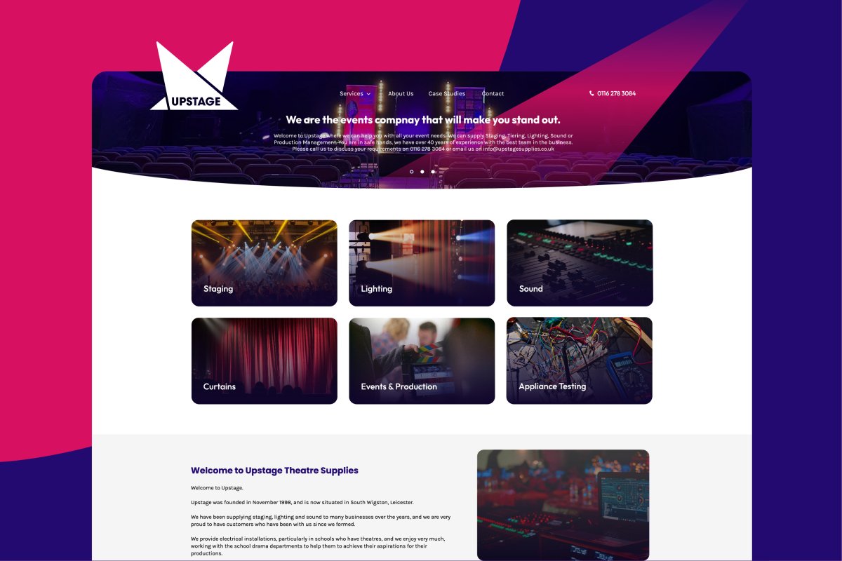
Taking this theme further, on the website the light beams cross the site to reinforce the branding.

Colours
Warm colours like deep blue stand for luxury and magic, whereas the razzmatazz shade then creates a stylish contrast by bringing out the deep tones.

Titles & Headings
An inventive and powerful font that fits the compelling concept.

Website Redesign
Through categories and case studies, this website showcases the services offered by Upstage Theatre Supplies. We made the decision early in the development process to make each category locatable from the landing page.
Regarding the design, we updated the site's appearance by integrating the new logo and impactful fonts, whilst utilising positive white space and high resolution imagery.


