Identity Rebrand
The new branding was asked to convey the 'Active' nature of the business, whilst appealing to the kind of people who do not see themselves as traditionally 'Sporty'. As well as this the logo needed to show a sense of working in partnership from local authorities, to public health sectors and schools. Visually the new identity had to be simple and recognisable whilst being able to work with a range of vibrant colours, backgrounds and mediums.
Logo
We set out to create an strong brand-mark that incorporated all these values whilst taking advantage of a vibrant and exciting colour scheme that fed into the physical activity side of things. The brand mark consists of 4 dynamic shapes coming together the create an "S" shape that embodies the several partnerships intertwining to make up the county of Suffolk.

Colours
The colour palette reflects our position in the wider Active Partnerships family. The vibrant colours represent the dynamic organisation and the rural countryside of Suffolk.

Titles & Headings
Neo Sans is an ultra modern typeface that is versatile and futuristic without looking crude, gimmicky or ephemeral.

Body Text
To compliment Neo Sans, Open Sans was chosen for the body text as a highly accessible typeface that legible at all sizes

Branding Guidelines
The new logo identity was developed into a comprehensive brand guidelines document to ensure external partners and companies would handle the logo correctly. This included guidelines of logo use on branded materials such as stationery, printed annual reports and clothing.

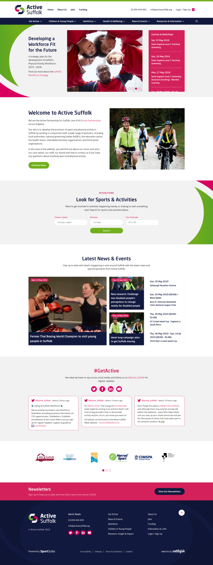
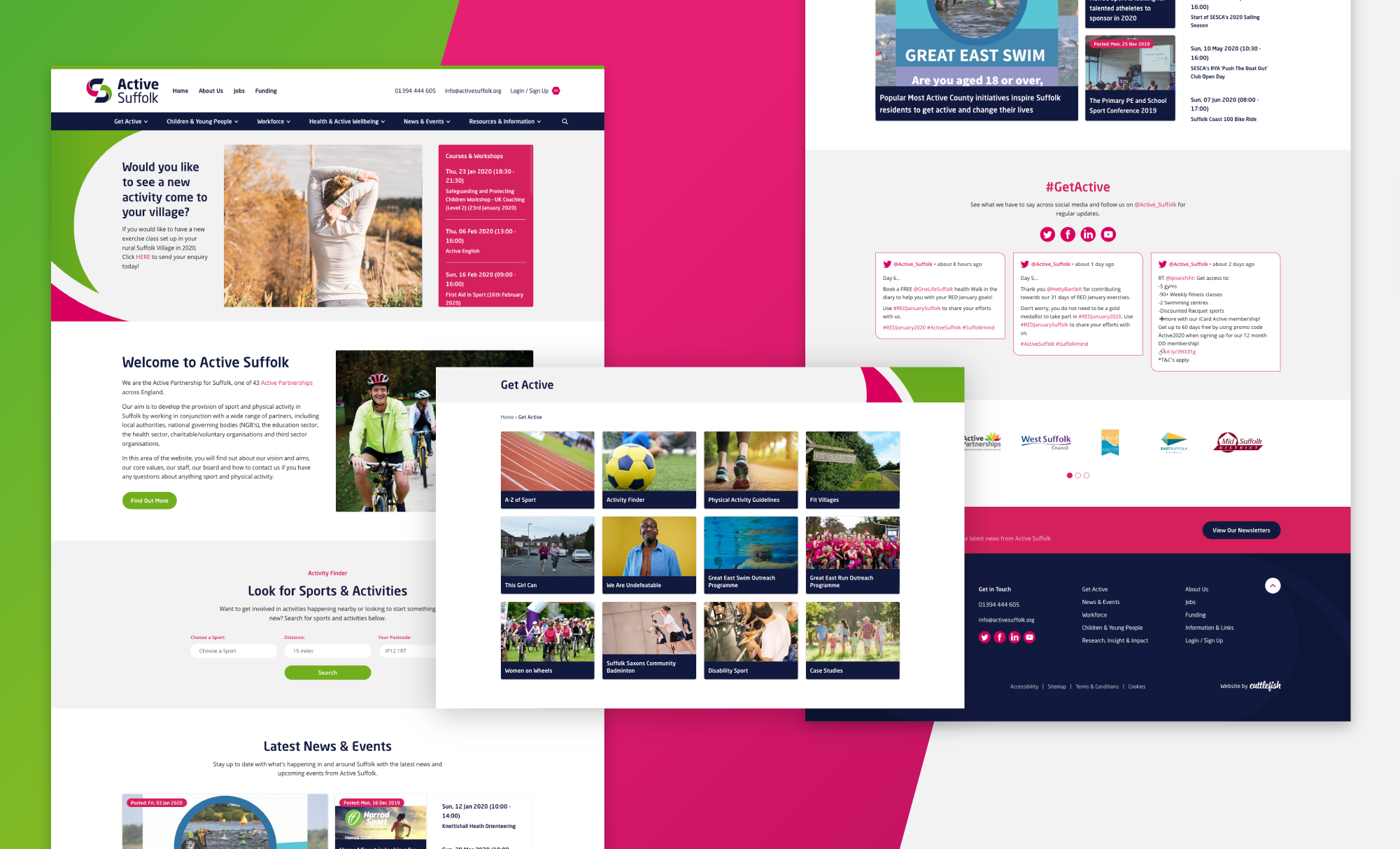
Website Design
With the new branding in place we set-out to refresh their website design to be more in-line with the new brand and a user friendly approach. The website incorporates SportSuite technology to provide tools that the users can use to find activities in and around the Suffolk county.


