Identity
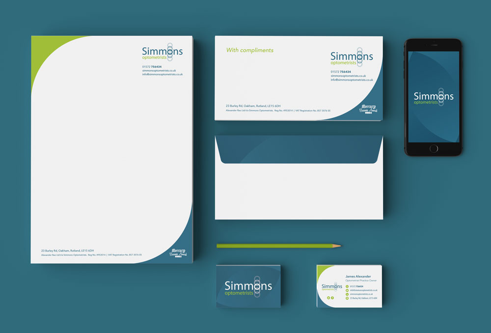
We were asked to bring the Simmons identity in line with their goals of becoming more of an approachable brand that appeals to people of all ages.
The Simmons logo uses the 'O' rings represent lenses often used in eye examinations. In this we saw the opportunity to bring the Simmons logo 'to life'. By animating the rings, it further plays on the simple idea and breathes a sense of fun into the logo identity.

Colours
The contrasting colours have been chosen to fit a brief of bringing the identity up-to-date to feel affordable and appealing to a wider audience.

Typeface
Avenir Next has been chosen for all print communications to provide as a highly legible typeface that has a unique flexibility for headings and body text.

Advertising
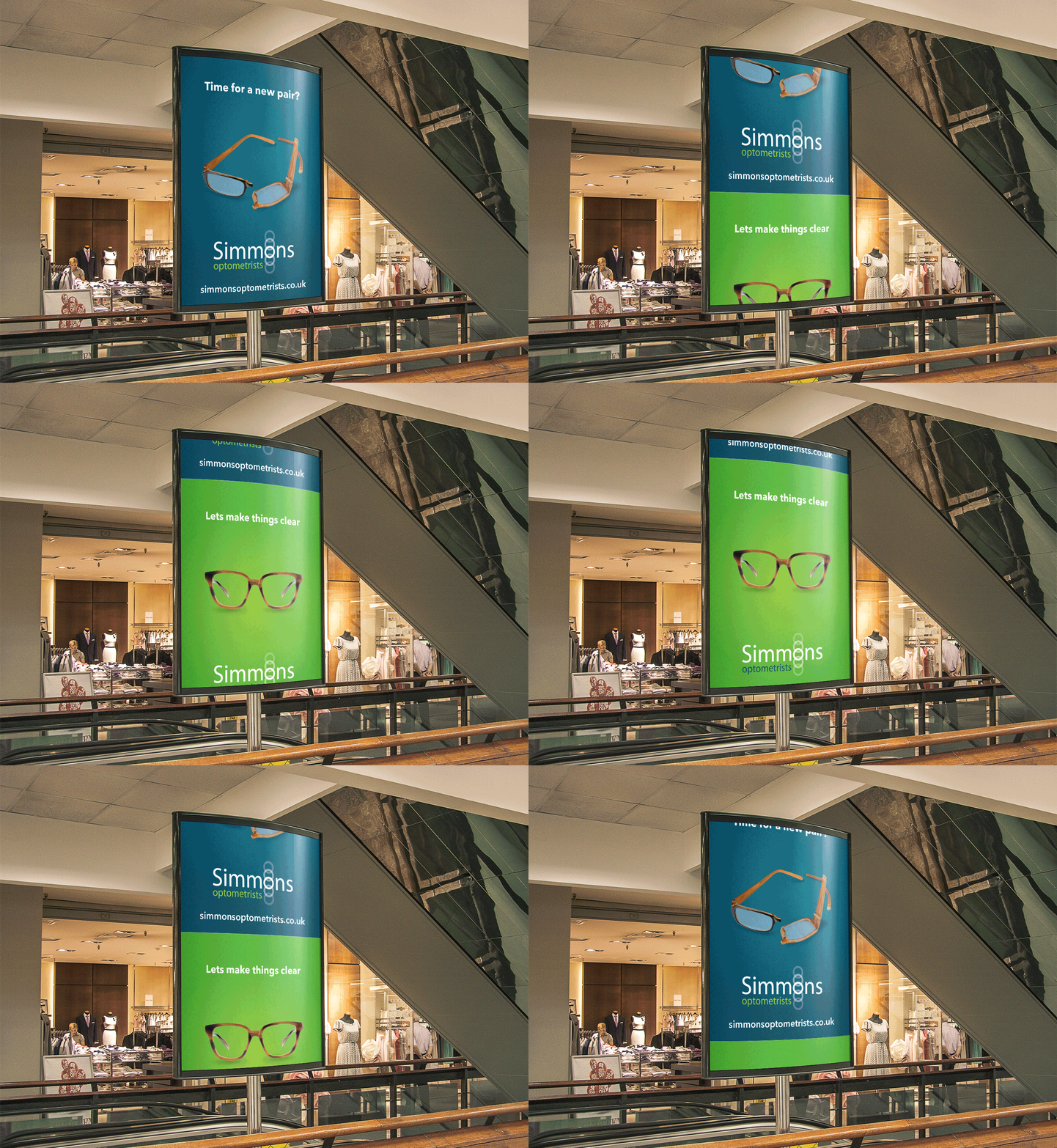
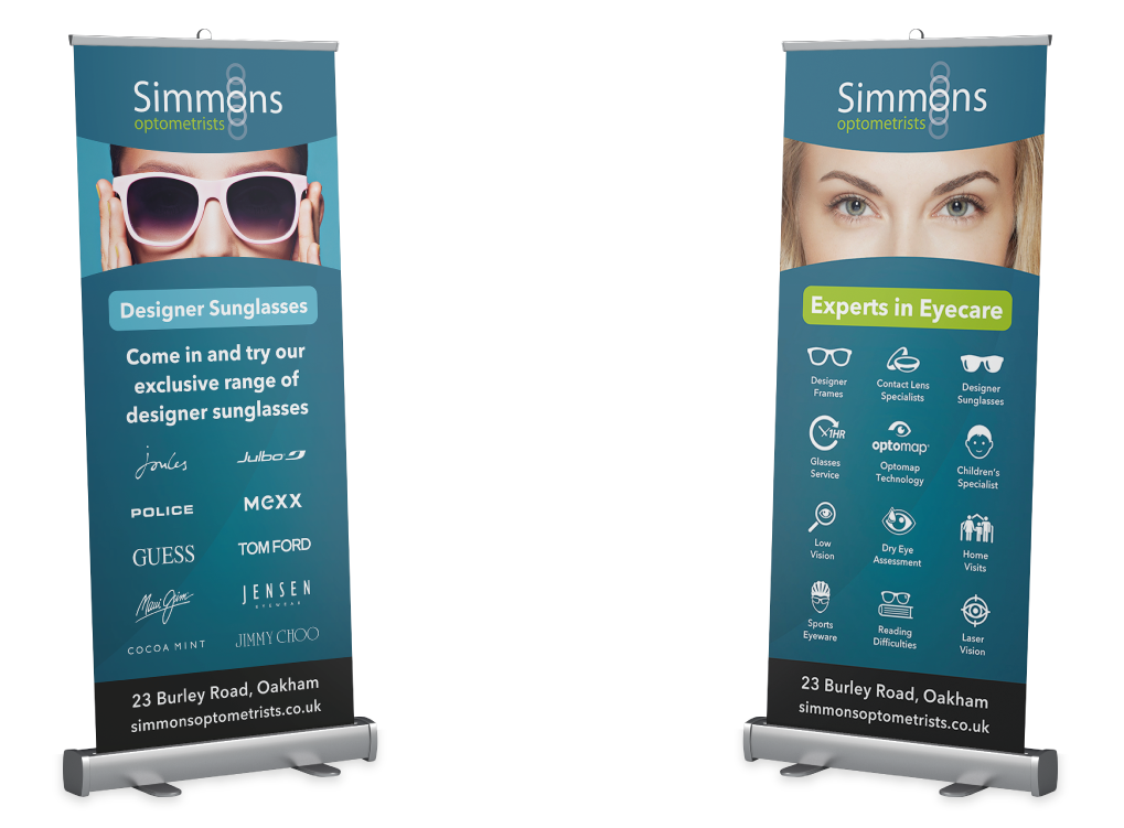
Using a combination of the Simmons brand assets, we created a poster advertising campaign that used a tongue-in-cheek style of delivery. The minimalist approach coupled with the Simmons colours and the bold 'Avenir Next' typeface made for impactful visuals that further strengthened the brand's identity in and around Rutland.
