Improved User Journey
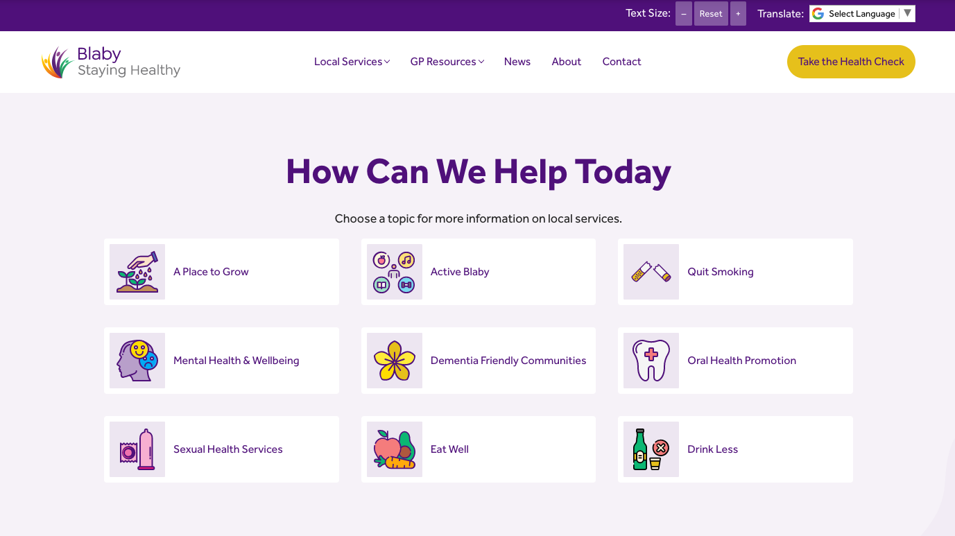
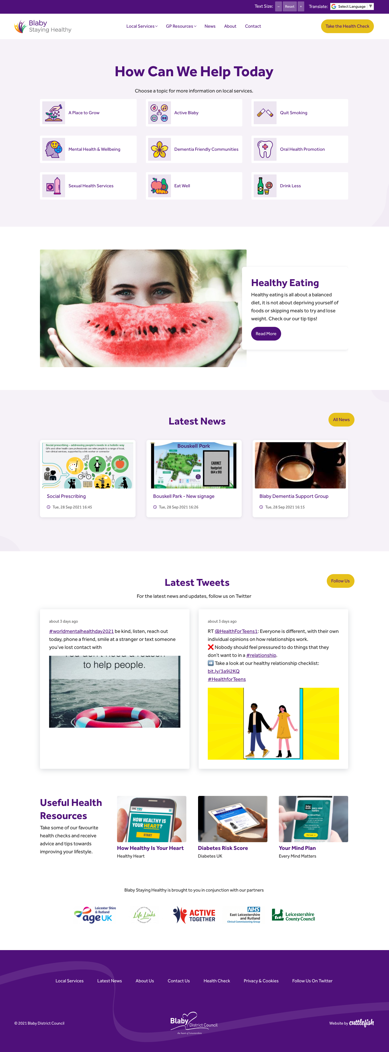
The landing page design focuses on the nine main service areas that Blaby Staying Healthy promotes to ensure users are easily signposted to the relevant pages.
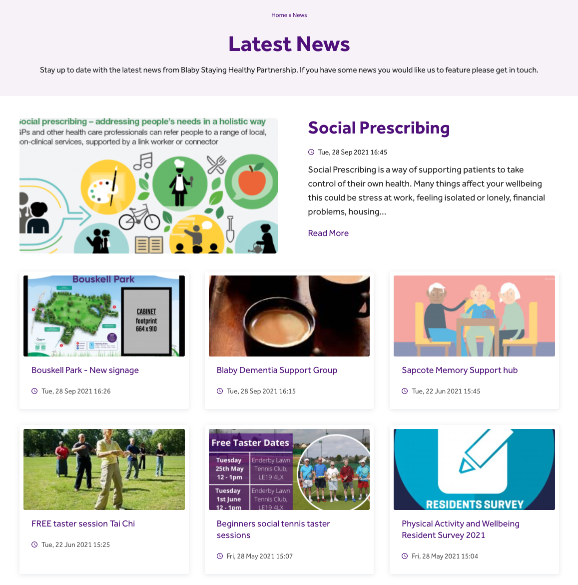
We also updated the navigation so that repeat users could quickly navigate to lower down pages with as little number of clicks needed, and added latest resources to the homepage.

Website Redesign
We redeveloped the core Blaby Staying Healthy website colour palette using the striking purple from their new logo. We enhanced the user experience by creating icons for all of their service areas, and applied an accessibility bar so that users requiring a different language or site contrast can easily change the website settings.


