Identity
Logo
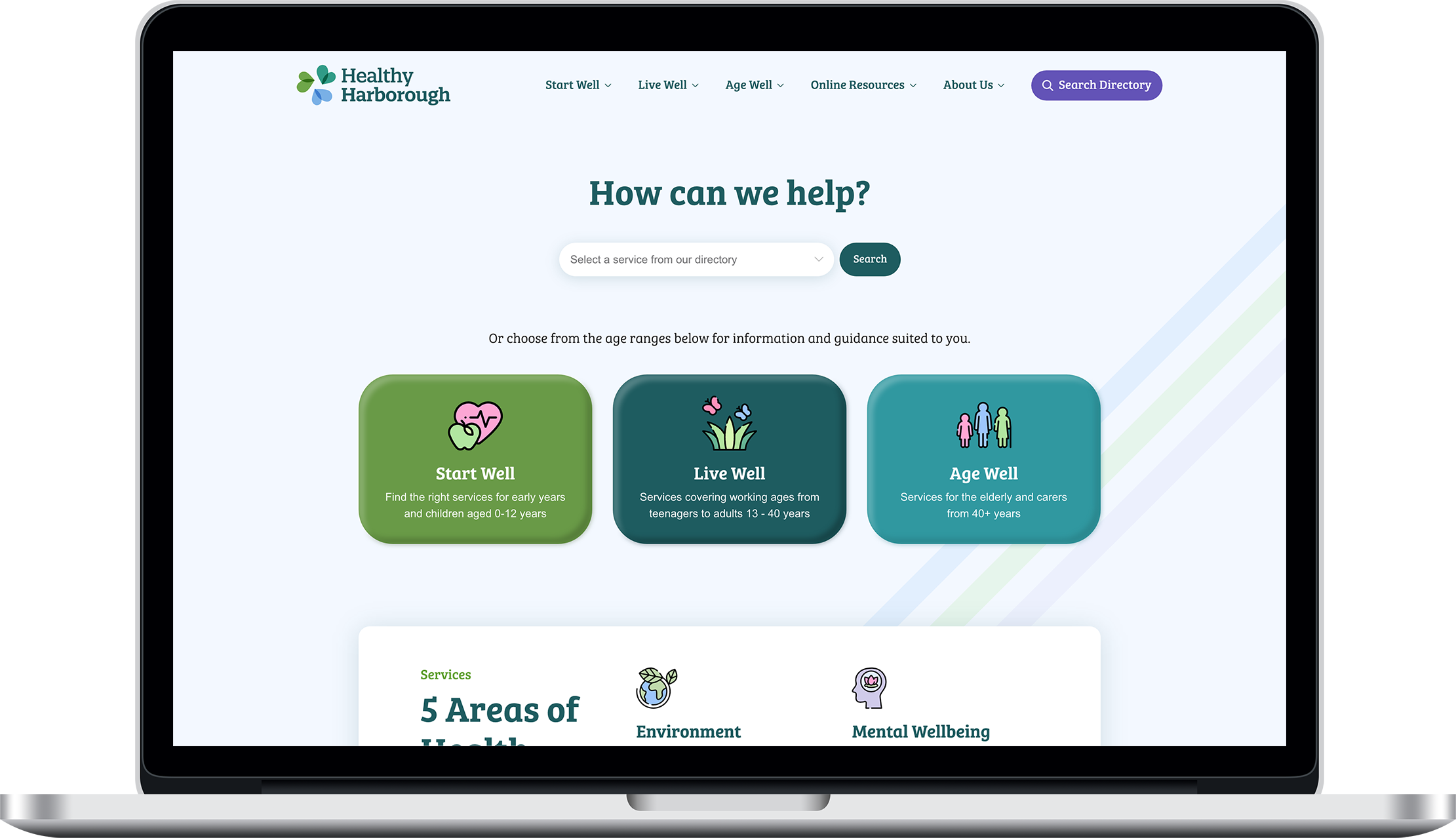
We were tasked with creating a logo for the new Healthy Harborough programme, and after presenting concepts to the Harborough Primary Care Trust, they selected the abstract mark made up of hearts. The hearts are a great symbol for health and could be seen as coming together to represent each of the 3 life stages Healthy Harborough works with: Start Well, Live Well and Age Well.

Typeface
The Bree Serif font family is an energetic and mature slab serif that maintains the original flavour of handwriting. The slabby nature of its shapes makes for a strong impression.

Colour
All three logos have a pastel colour make-up inspired by the Harborough council logo and branding. The logo-marks have an overlapping effect that is commonly seen in health industry brands as it creates a calming and clinical mood and embodies connection and diversity.


Website Design
We developed the website colour palette with calming shades of green to promote health whilst also adhering to Harborough District Council's branding. We enhanced the user experience by adding dynamic hover transitions across all elements to feed into the user engagement nature of the site.
Services Directory
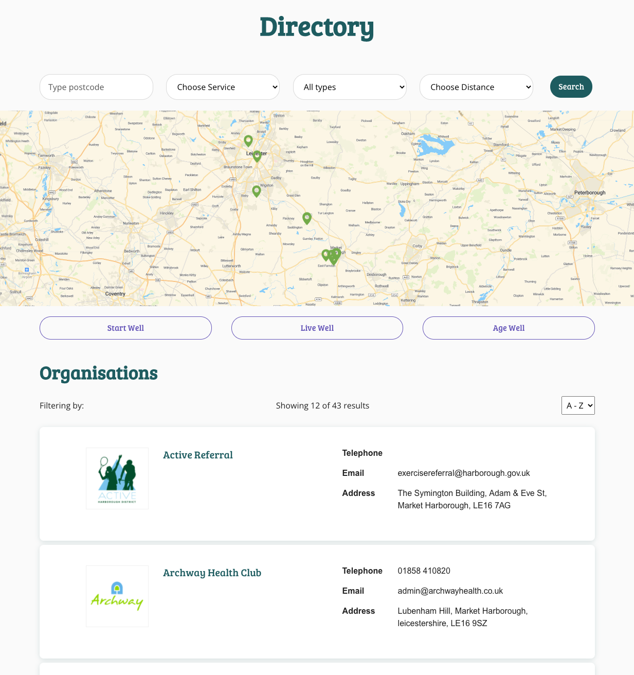
Harborough Primary Care Trust works with many charities and organisations to help local people find support for their physical and mental wellbeing. We were asked to create a directory so that the public could easily search for opportunities as well as helpful resources in a single website.


