Improved User Journey
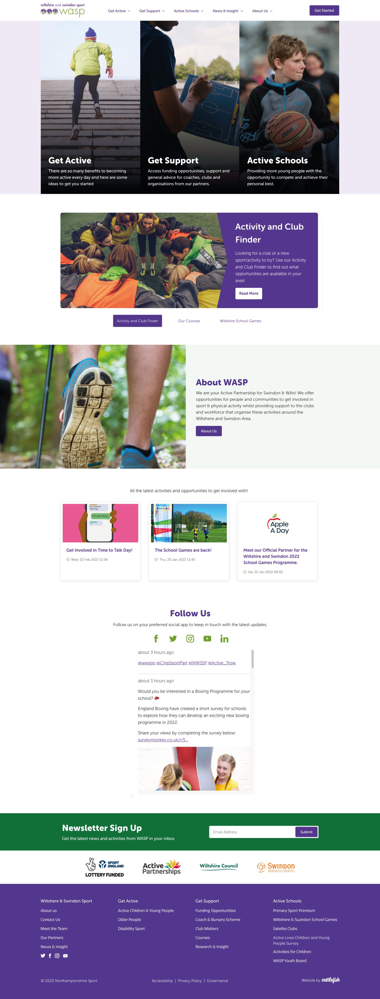
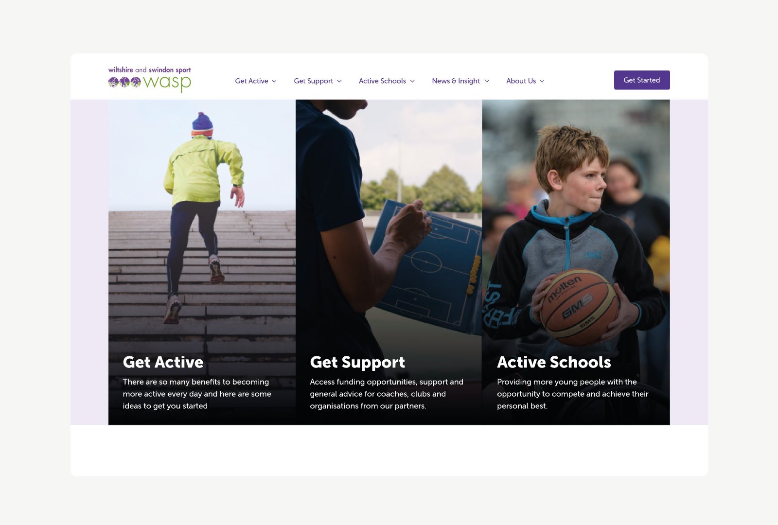
The landing page design promotes the three main areas in which Wiltshire & Swindon Sport operates to ensure that users are easily signposted to relevant pages.
We created a large open navigation so that repeat users could quickly navigate to lower down pages with few clicks.
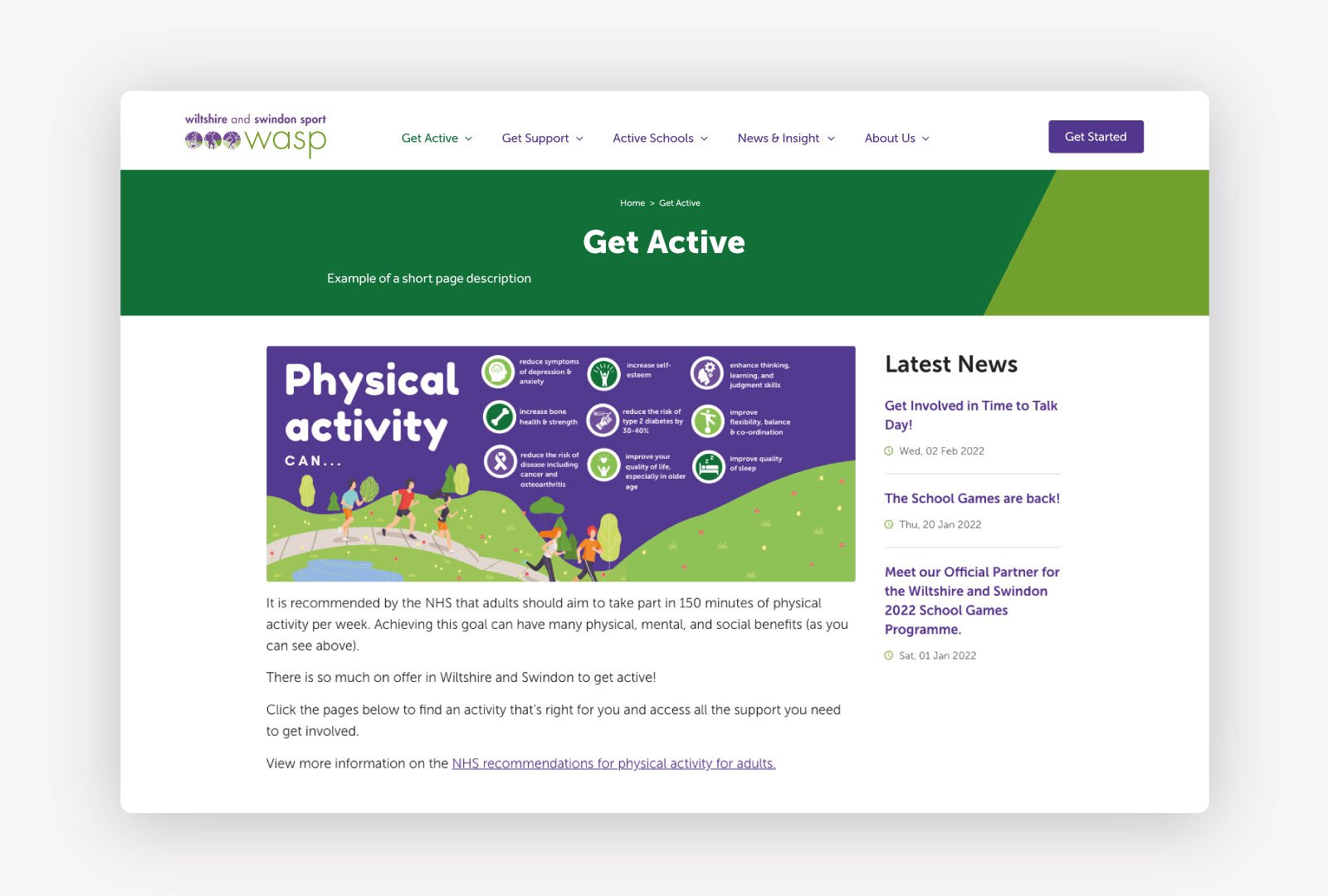
Website Redesign
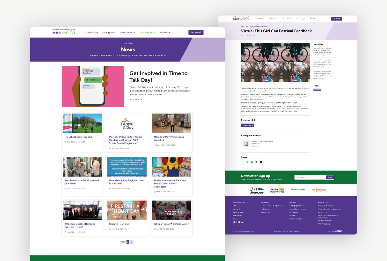
We enhanced the user experience by adding dynamic hover transitions across all elements to feed into the fun and sporty nature of the organisation. We ensured that WASP's strong purple and green colour palette was utilised across the website to build a cohesive identity.
