Identity Rebrand
Logo
A complimentary palette made of strong, trustworthy blue's matched with a stand-out orange.

Colours
A complimentary palette made of strong, trustworthy blue's matched with a stand-out orange.

Titles & Headings
A fat rounded heading with a family feel and heaps of personality.

Website UX
A Fresh New Look
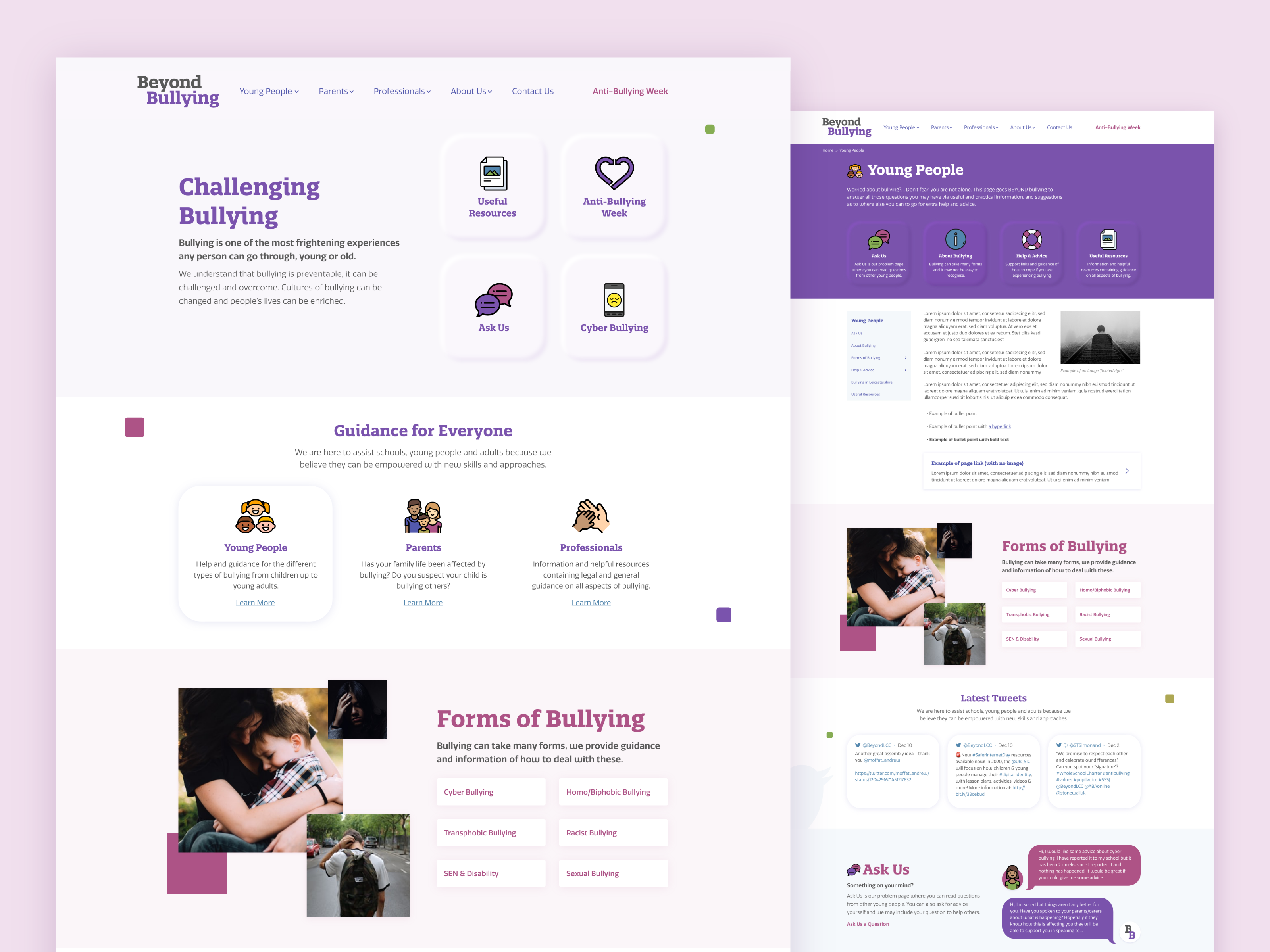
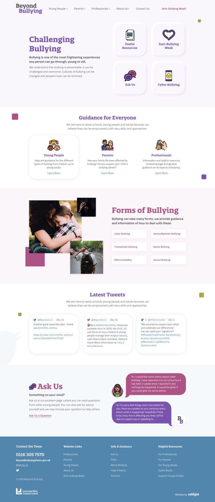
Using the valuable content from the previous site, we were able to start from scratch to reconsider the site structure to deliver better user experience.
Being primarily a tool for visitors to get guidance and help, we positioned the most helpful content high up on the landing page so that people could find the information they need quickly.
We designed the website hand-in-hand with the new brand direction to create a site full of pastel hues and neo-morphism that aims to have a gentle look that users would find calming and approachable.


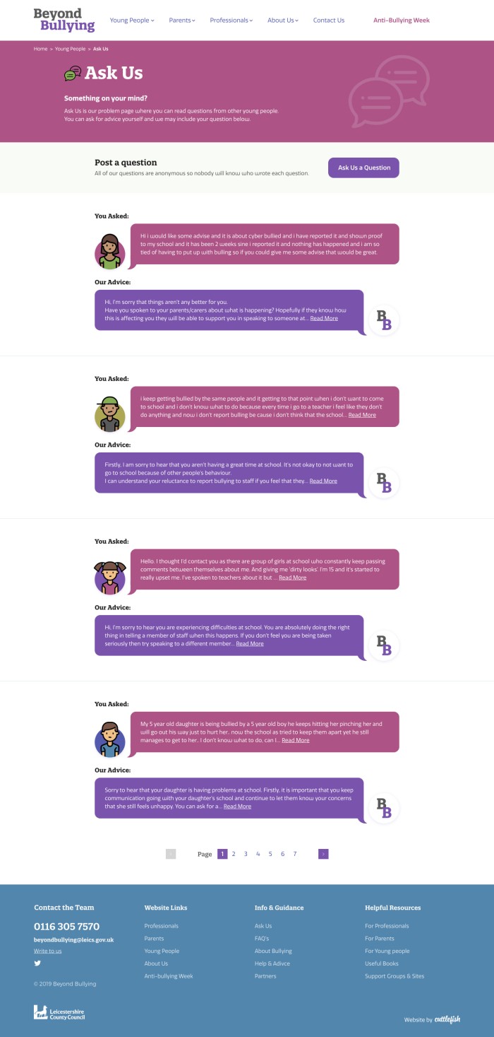
Ask Us
We created an anonymous FAQ style area that children and parents seeking specific advice could use. Any question would be sent to the Beyond Bullying team and if deemed useful the conversation could be put on the site to help other future cases.


