Brand Identity
Mascot
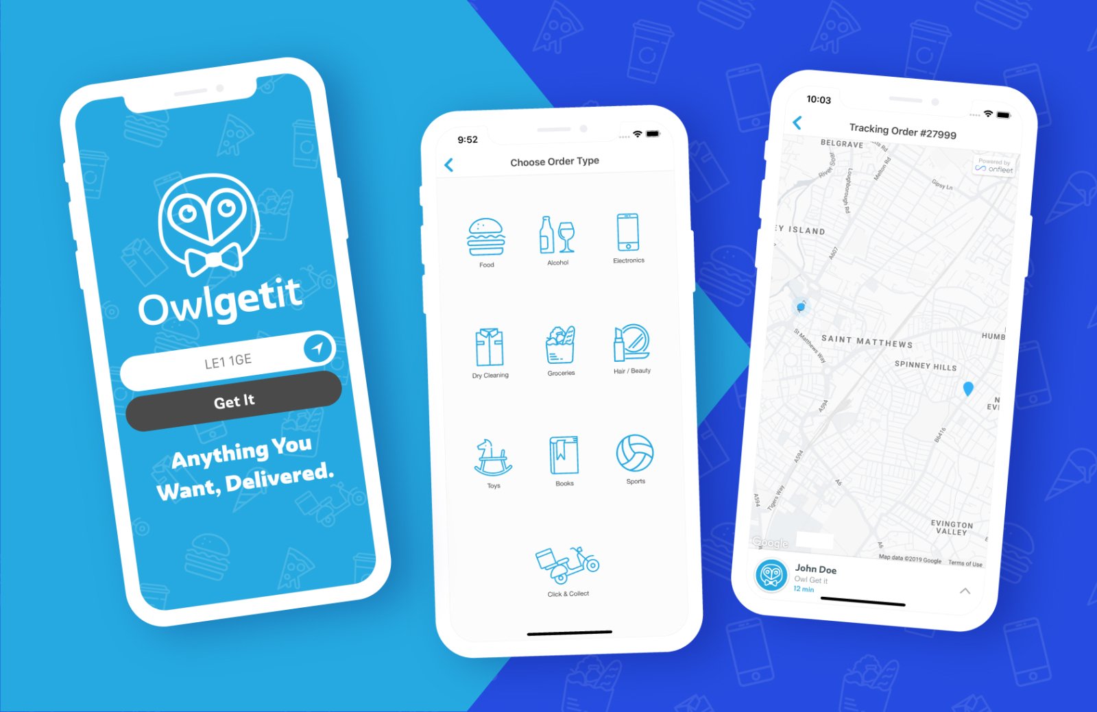
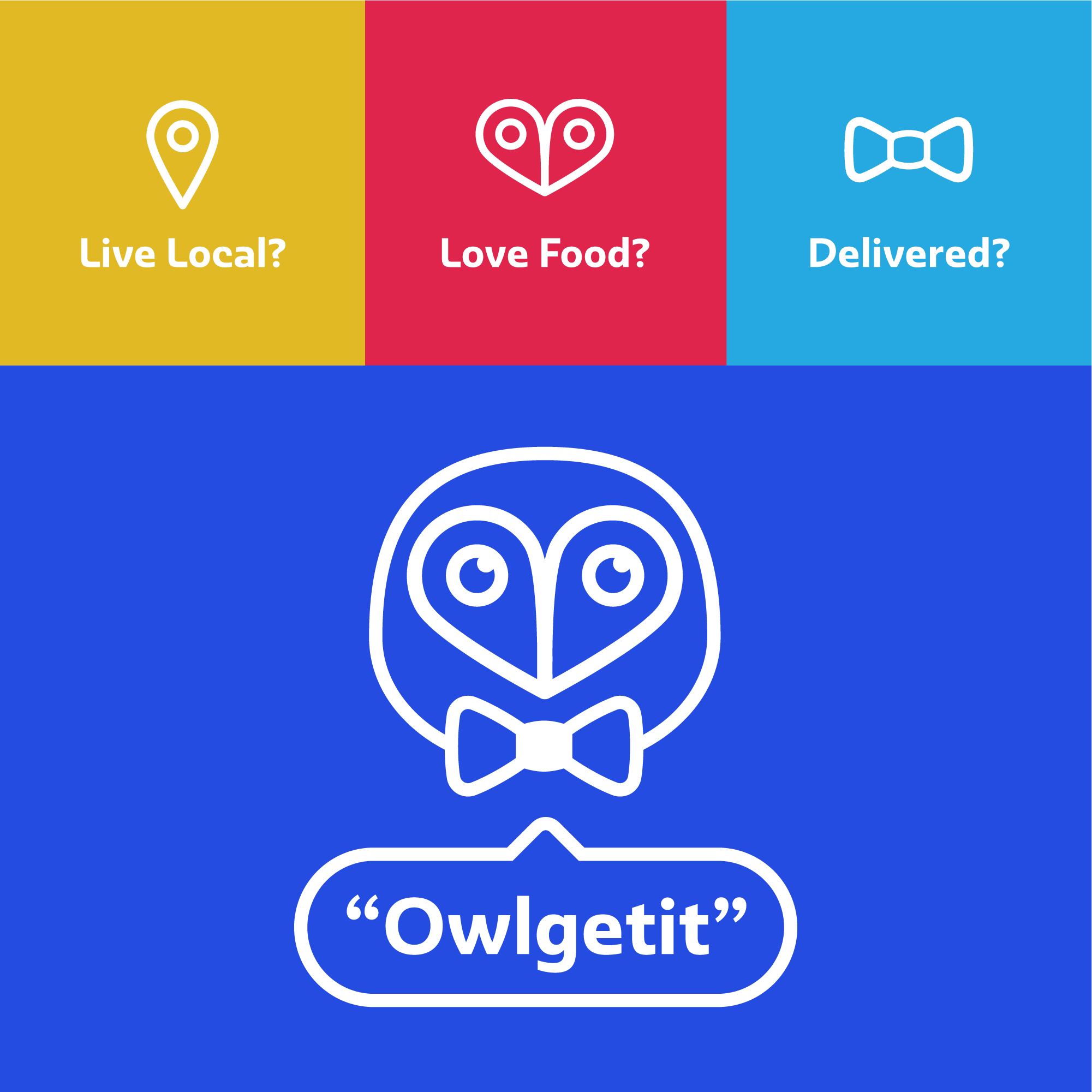
The project updates the official Owl brand mark to create an identity around the better friendlier and approachable character. The construction of which is created from two location pins, combined into a heard shape that makes the face of the owl.

Colours
A bright and vibrant palette that isn't afraid to stand out.

Typeface
A unique typeface with character and versatility that matches the fun carefree nature of the company name.

Marketing
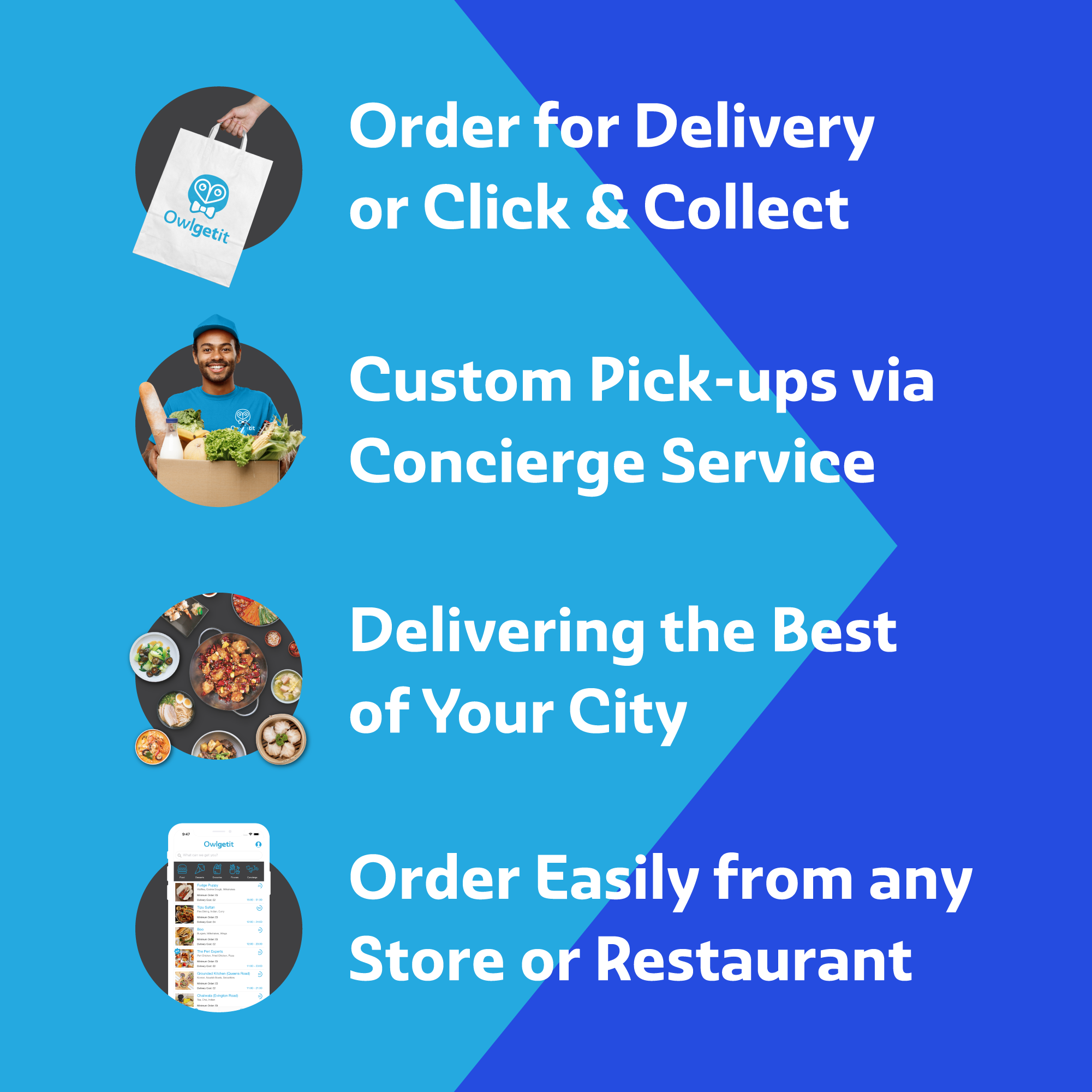
We lent heavily on the brand identity and utilised the unique logo construction to help translate how easy to use the app and ultimately the concept of OwlGetIt. It makes for a tongue in cheek approach that lends itself to fun nature of the delivery company.
The bright and striking colours help to grab peoples attention and make the new rebrand more memorable.
App Development
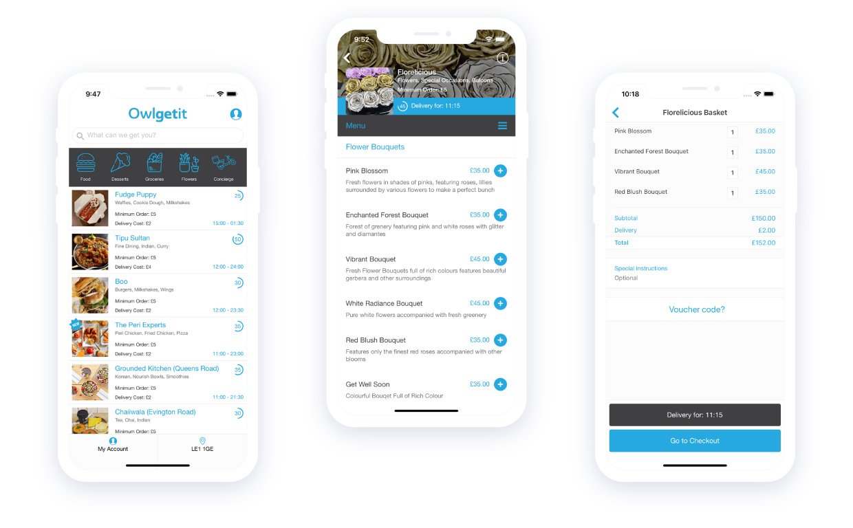
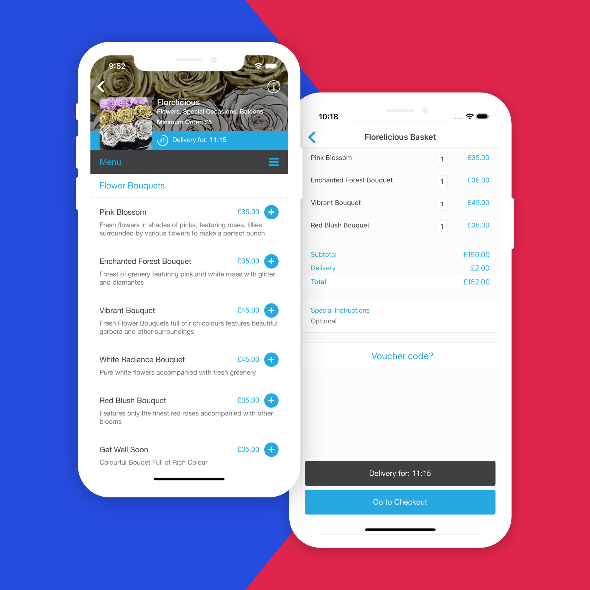
We developed an API ecosystem that linked the website with both iOS and Android apps.
The user journey and ordering process required all orderr coming from the customer facing apps to integrate with with both the vendor partner app and the driver app (Onfleet).
