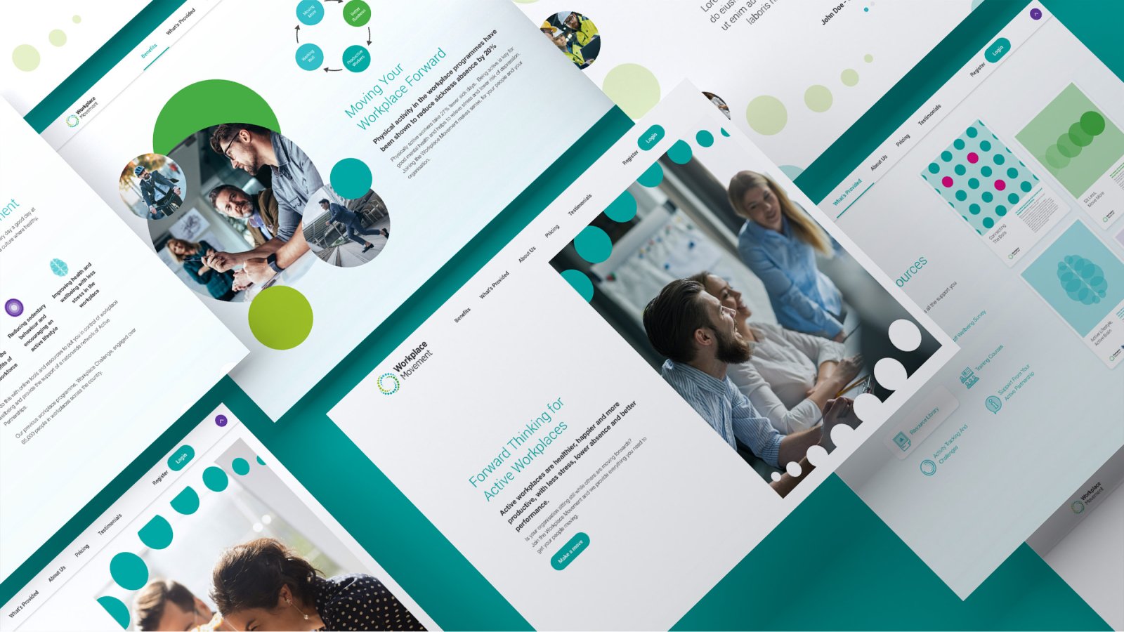
Identity Rebrand
Logo
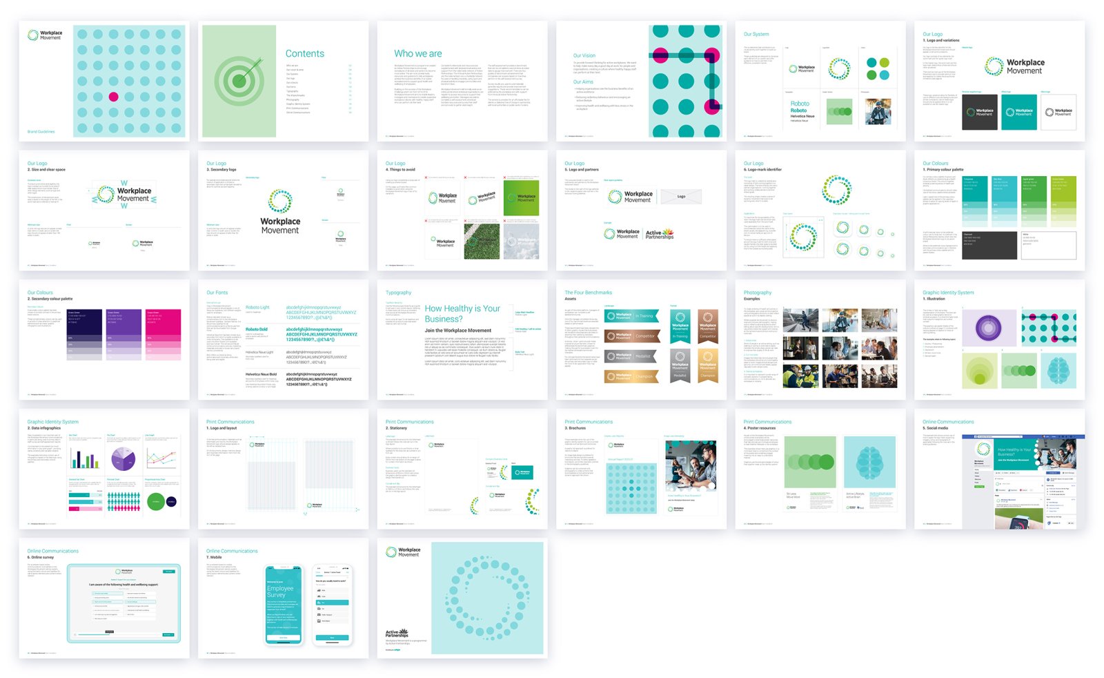
The logo was designed to embody movement as well as a coming together within the Active Partnership network. The logo-mark shape creates a sense of dynamic movement that looks to be spinning even when it is static.

Colours
A palette using a mix of greens and blue to have a clinically fresh and healthy direction.

Titles & Headings
A neutral typeface with great screen and print legibility.

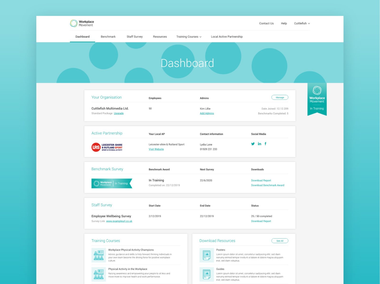
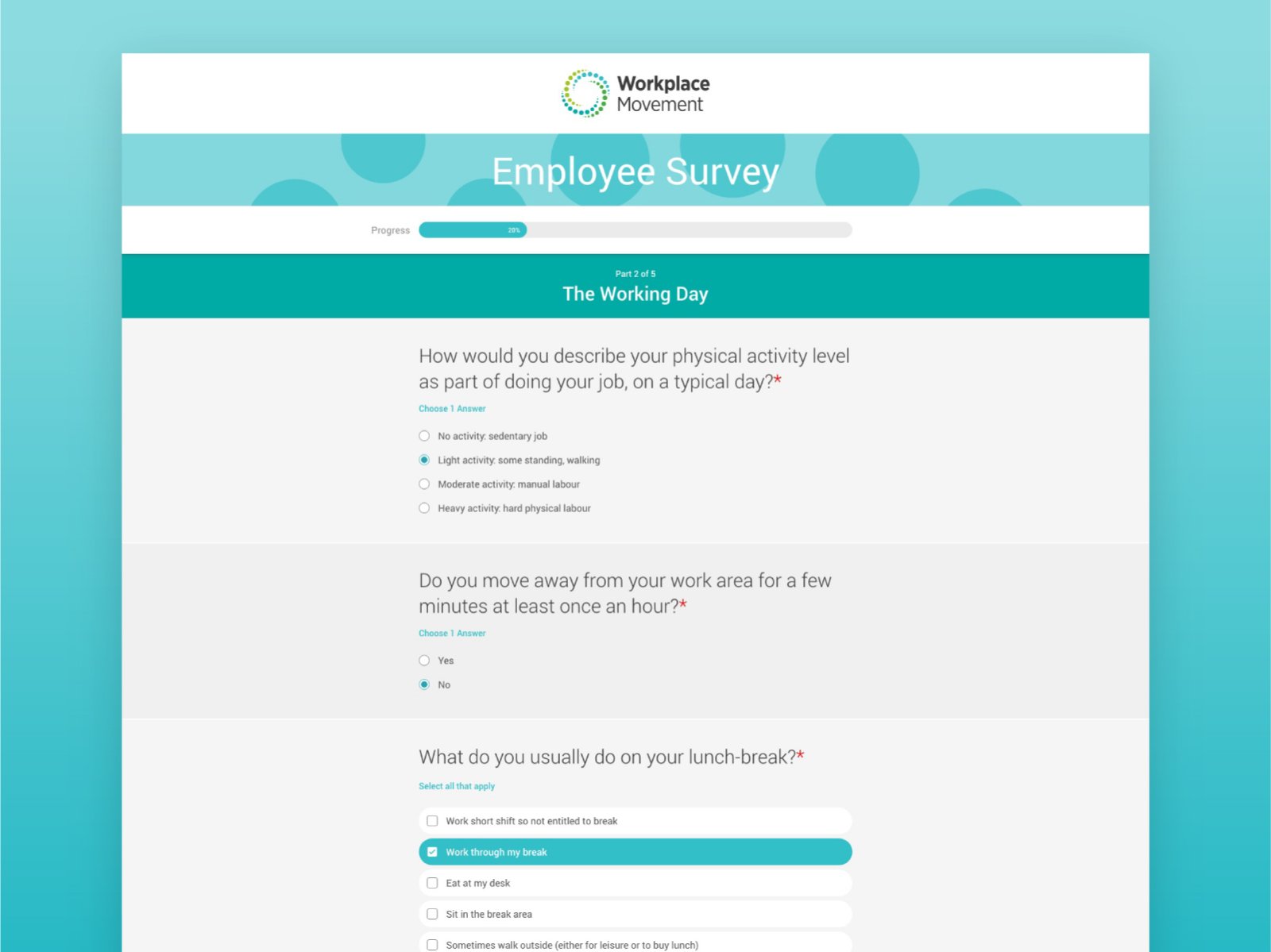
Dashboard & Survey
Benchmark
As part of the online platform, managers of workplaces can complete a self assessment survey where one of four benchmark levels are awarded based on performance.
These benchmarks have been devised into four ribbon graphic visuals that businesses will be able to download and use freely to advertise their wellbeing standards throughout their personal communications.

Poster Resources
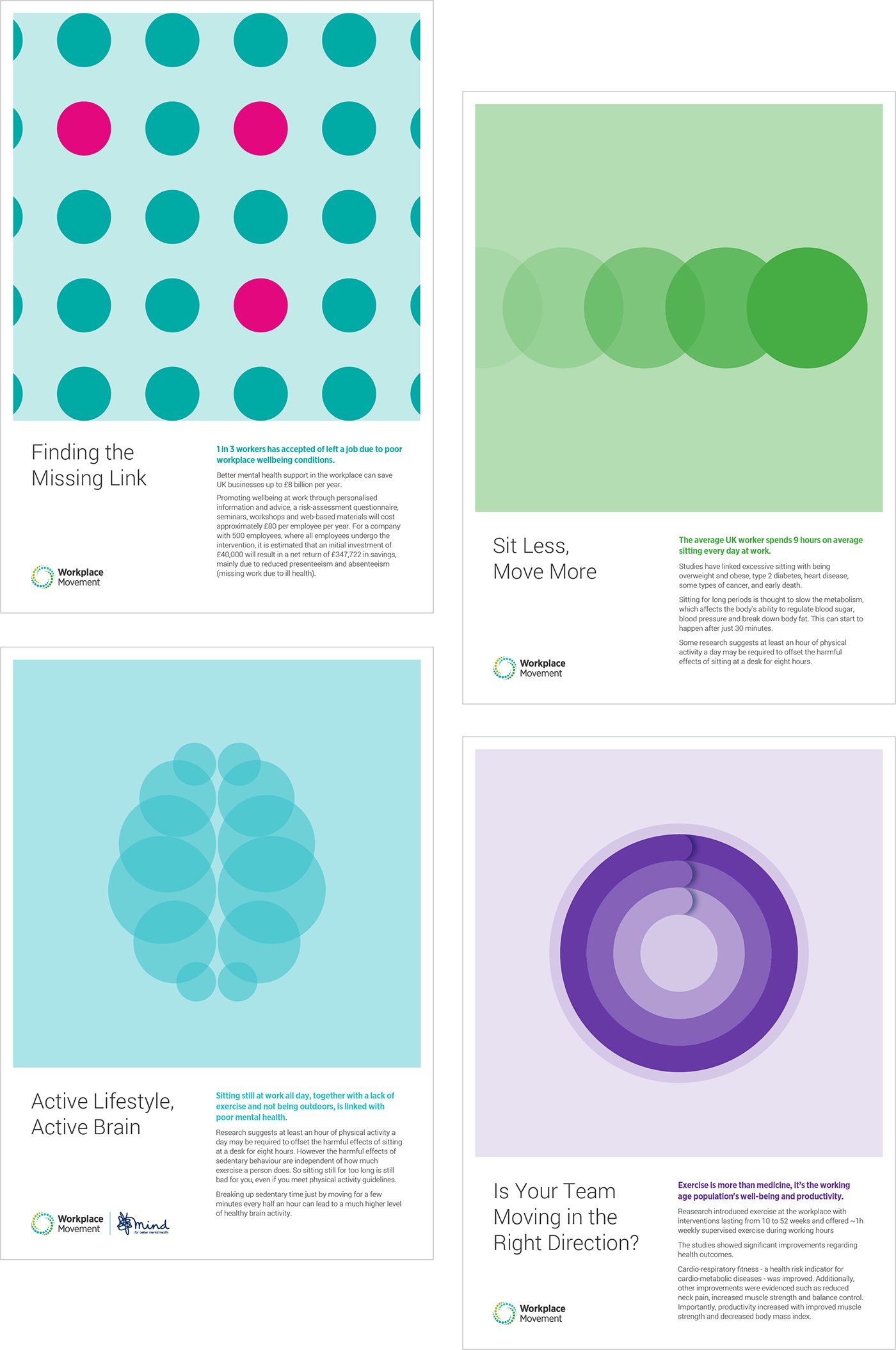
As part of the Workplace Movement's online portal, businesses will be encouraged to download poster resources that help educate and motivate employees to lead healthier lifestyles in the workplace.
The examples shown here use graphic system in an ultra-minimalist style to compliment the written context of the poster and help condense the wider message into an appealing manor.
